The Impacts of Colors in Interior Design
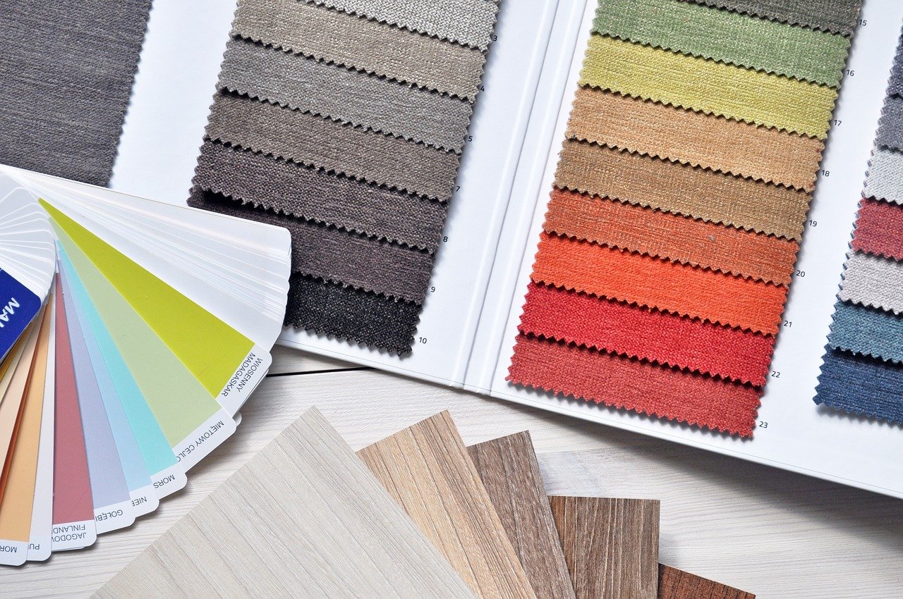
One of the most important design elements is color. For many, colour is a primary component of our experiences. Design researchers and interior designers are continuously engaged in the study of impacts of colors. In addition to psychological aspects and benefits attributed to colors, each colour saturation and brightness are linked with their emotional powers. Saturation refers to the pureness of the colour. For example, less saturated colors have more grey or black in them. Steel-blue is less saturated than true blue.
Brightness is based on the amount of white in the color, or how light a color seems. Bright colors are less saturated. These lighter, pale tones can have a relaxing effect. For example, true red is associated with anxiety, but a pale, blush pink, that is both less saturated and brighter, is a soothing color. Colors that are deeply saturated and less bright, such as amerald green, can feel intense or energizing.
When referring to colours, people refer to reds, yellows, and oranges as “warm colours,” while greens, blues, and purples are “cool.” These categorizations are not a coincidence. When we are in rooms that feature warm colors, we feel physically warmer. Cool colours make us feel cooler. That’s one of the reasons reds are so popular in the winter, while turquoise and teal are more popular in warm weather.
And of course, each color has associated psychological effects. Decades of research confirm that some colors consistently evoke certain emotional responses.
Red
Red is the color of power, aggression, and passion. It also triggers the appetite (which is why it is such a popular color in restaurants.) Red is a warm color, which means red accents can heat up the space quickly. However, red is also associated with anger and control. Incorporating too much red in the home can make people feel anxious or unsettled, so use it sparingly if you’re trying to achieve a calming effect.
Orange
Orange is associated with energy, sports, competition, and innovation. It’s another warm tone that can quickly make a space feel snug and cozy. However, orange is such an energetic color that it is rarely used as a dominant color in home design. It is more often seen in office settings and sports facilities. It’s not the color to use if you’re trying to create a serene space, but when skillfully incorporated into your interior design, orange can serve as a cheerful mood lifter.
Yellow
Yellow is the only warm color associated with relaxation. It is associated with happiness, creativity, and innocence. Because yellow is also associated with nurturing, it is often featured in kitchens, children’s rooms, and private areas of the home. Less saturated yellows also work well with neutrals to create a relaxing effect. Yellow can also work in sunny spaces, intensifying the effects of sunlight.
Green
Green is a soothing, calming color. It is associated with balance, harmony, and nature. It is also the color of growth and renewal. Green is often used in professional settings to help occupants feel calmer. That’s why actors waiting to appear on TV are kept in a “green room.” In homes, green can create a serene feeling that soothes and calms. However, a little green goes a long way. Saturated greens can quickly overwhelm, making the room look dank or dark. The use of bright greens or apple greens make a room look cheerful, but if used repeatedly, these colors can take over. Conversely, greyish greens, sage tones, or khakis often read as a neutral color, and help create a relaxing space.
Blue
This is a color that communicates fresh, calm, serenity. It is a conservative, orderly color that works well in professional settings. It’s popular in health offices and financial institutions. However, saturated blues can evoke oceans and water, and work very well beside bright whites. Blue is also associated with sadness (feeling blue) and may not be a good color to ward off depression. Finally, research shows that blue is one of the least appetizing colors, which may be why it’s used less often in kitchens and restaurants.
Purple
This is an indulgent color that evokes feelings of luxury, privilege, and specialness. It is a ceremonial color used in many religions to connote divinity. It is also a color associated with exceptional individuality, creativity, and even quirkiness. In a home, the use of purple is unusual, which makes it a striking statement. Pale purples, or lavender, is considered feminine, soft, and comforting. Deeply saturated purples, like eggplant, are powerful. Too much dark purple can make people feel sad. No matter which shade is used, studies show that using too much purple makes some people feel irritable and arrogant.
Grey
When appropriately used, grey accents in home design can create neutrality and balance. Because it is a balance of black and white, it can be used as a neutral. However, many greys are actually a shade of blue, green, yellow, or even purple, so it’s important to pay attention to the tonality of any grey. In color psychology, grey has negative connotations associated with depression, loss, and listlessness. Rooms that are dominantly grey can feel cold and unwelcoming.
Brown
Brown is a color often found in nature. Studies show the use of brown in a home evokes feelings of strength and reliability. Using brown in a room can create a sense of dependability, security, and safety. Brown is present in many rooms as a part of wood furniture or wooden cabinets. Using brown on walls, floors, or furniture in spaces with a lot of brown wood can cause the room to feel heavy, unimaginative, or dull. Combining browns with greens, whites, and neutrals is an effective way to create a serene, cheerful space.
Black
Many people think that black is the absence of color, but in fact, black absorbs all light in the color spectrum, meaning it is the combination of all colors. When you add many leftover paint colors together, it often creates black. Research in color psychology shows that black evokes many different associations. It is often linked with death, unhappiness, and mystery. But it’s also the color of sophistication, seriousness, intellectualism, and sexuality. Black is not a cheerful color, so it’s usually used as an accent. When used sparingly, black elements can create calming harmony and balance in a room. Liberal use of black can also make an area look powerful, dramatic, or important.
White
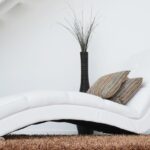
White is a neutral color that is common in most homes. Most ceilings are white, and this color is the most popular choice for walls. White reflects light, making rooms feel brighter, more spacious, and bigger. It also evokes feelings of cleanliness, purity, and innocence. Too much white, however, can feel bland or sterile. Notably, few people list white as their favourite color. But it is an easy color to work within interior design. White goes with anything – dark or light, bright or saturated. White provides a practical background for statement pieces like artwork or sculptures, which is why so many museums have white walls. Importantly, it is easy to see imperfections on white. Dirt, wear, or stains are easy to spot on things like white sofas, white floors, and white cabinetry.
Personal Associations
While there is plenty of research that shows how most people react to colors, personal experience with a color trumps social norms. Our personal history influences our emotions around colors. While American brides wear white, it is the color of death in some cultures. If you had a carefree, happy childhood in a bright red room, red may cheer you up and make you feel content as an adult. If your beloved grandmother’s kitchen was bright purple, purple may represent caring indulgence and stimulate your appetite.
So whether you find your associations with color align with research, or you’ve created an unusual personal association, make sure the colors you choose for your home make it feel like a comfortable sanctuary that soothes and relaxes. And if you find you avoid certain rooms in your home, color changes are one of the easiest ways to make it feel more welcoming.